Abstract
An excerpt from The Next Economic Disaster: Why It’s Coming and How to Avoid It.
The following is an excerpt from Richard Vague’s The Next Economic Crisis: Why It’s Coming and How to Avoid It ( University of Pennsylvania Press, 2014).
Richard Vague is a managing partner at Gabriel Investments and has had decades of experience in banking and credit. He serves on the Board of Trustees of the University of Pennslyvania and is a member of the U.S. State Department’s Advisory Committee on International Economic Policy.
Private debt growth is integral to GDP growth. But very rapid growth in private debt often leads to calamity because it is evidence that lenders have lent too much and those loans are leading to the construction or production of too much of something, such as housing. I consider this the “excess credit point.” Our view is that roughly 18 percent growth in private debt to GDP growth over five years serves as the benchmark for when lending is excessive. This is especially true when that level of growth persists for several years and is coupled with 150 percent or more in absolute private debt to GDP. It signals that debt has fueled an increase in the supply of that something (e.g., housing) at a rate faster than sustainable demand. That something can vary from crisis to crisis. In the lead-up to the 2008 crisis, it was largely houses, but in other crises, it has been everything from stocks to skyscrapers.
When I say private debt to GDP grew 18 percent in five years, it means that the private debt to GDP ratio in, for example, 1997, was 18 percent greater than the private debt to GDP ratio in 1992. And if I say that five-year private debt to GDP growth was over 18 percent for two years in a row, it means that, for example, the 1997 ratio was over 18 percent higher than in 1992, and the 1998 ratio was over 18 percent higher than in 1993. I will refer to these five-year growth rates throughout the book.
In fact, whenever you see very rapid loan growth, it is likely that the following three things have happened: First, lenders have lent amounts that will not be fully repaid and financed the building of too much of something. Second, prices have increased well above the trend for those asset categories where the lending has been concentrated (e.g., housing) primarily as a result of that lending—giving both lenders and borrowers a false sense of confidence. And third, because so many bad loans have been made, lenders will incur large losses and require assistance—the very definition of a financial crisis.
A rise in asset values is regularly present in these overlending situations, but it is a dangerously circular phenomenon, because it is the overlending itself that is often the primary driver of this increase. Lending policy itself is a primary driver of values. If everything else is the same and lenders change from requiring a 25 percent down payment on houses to a 10 percent down payment, housing prices will increase—because there will now be more eligible buyers lining up at open houses on Sunday. This loan-policy-driven increase in prices generally encourages even more building and buying because the upward price movement makes housing seem like an even better investment.
Here is one other example: if lenders generally make loans to those wanting to buy a small business at three times the pretax earnings of those businesses, then those businesses will likely be valued at not much higher than three times pretax earnings. However, if most lenders then change their policies to lend at five times pretax earnings, small business values will then tend to increase to an amount of roughly five times their earnings—even if there is no fundamental change in the performance of those businesses. It’s circular.[i]
It takes only changes in lending policy to change values, but it takes actual income to sustain those values. If lending policy pushes values beyond what can be supported by the borrowers’ incomes—as was the case with much of the mortgage lending in the years before the 2008 crisis—it creates unsustainable values and a false sense of wealth and confidence. Lenders pull back, and booming markets like Las Vegas and Phoenix are suddenly engulfed by “For Sale” signs.
Growth in private loans is generally a positive, but it is a central thesis of this book that such growth can become too high. If credit standards are relaxed and the result is that loans grow too rapidly and too much gets built or produced, that spells trouble.
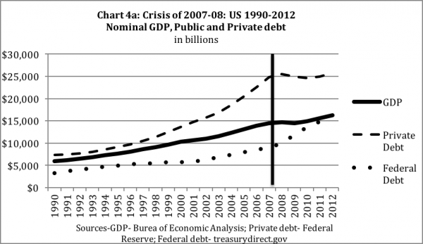
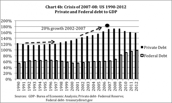
While US private debt to GDP growth is currently flat, as shown in Charts 4a and 4b (which I refer to as the “debt snapshot”[ii]), the crisis of 2008 came after the point where private loans to GDP had grown 20 percent in five years and total private loans to GDP exceeded 170 percent. (Debt snapshots for all the crises discussed in this book can be found in Appendix C.)
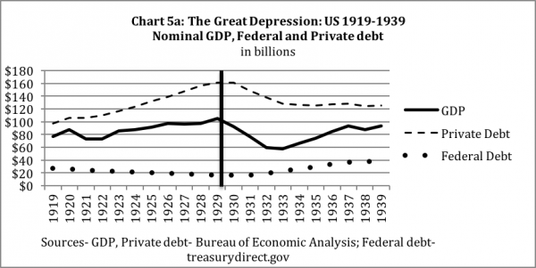
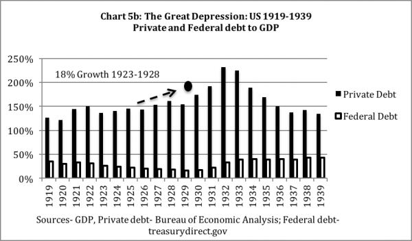
I wondered whether this was also true for the crash of 1929, a crisis for which an endless variety of explanations have been offered. When we reviewed the data, just as in the period before the Great Recession, we saw a pronounced acceleration of lending in the mid- to late 1920s. By 1928, private loans to GDP had increased almost 20 percent, and private debt to GDP reached a towering 161 percent (see Charts 5a and 5b). In fact, this was the first peacetime moment in US economic history when these two “twin peaks” of debt were reached simultaneously, and it was perhaps a time of far less sophistication and resilience in financial markets. Lending in the 1920s was directed more toward business borrowers than was true in the 2008 crisis.
In the 1920s, loans poured out to finance skyscrapers, business acquisitions, cars, homes, radios, and much more. Whatever other causes might have contributed to the crash of 1929 and the Great Depression, the rapid run-up in debt was central to the story.
Given the centrality of increased private debt to both the 1929 and 2008 calamities, we looked at the two other largest crises of the last generation to see if private debt played a part there as well: Japan’s crisis of 1991, which followed its “economic miracle” of the 1980s, and the Asian crisis of 1997, which followed the “Asian economic miracle” of the 1990s. As shown in Charts 6a and 6b, in the period from 1985 to 1990, Japan’s private debt to GDP increased by 28 percent and reached 213 percent of GDP. And in the five-year run-up to the Asian crisis of 1997, private loans to GDP for South Korea and Indonesia grew 29 percent and 43 percent, respectively, and in South Korea, private debt to GDP reached 170 percent.
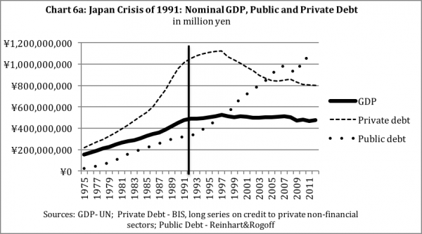
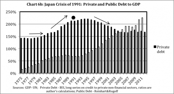
Runaway lending created the Japanese and Asian economic miracles, but those miracles brought crisis.
Though less pronounced, even the Reagan revolution of the 1980s was in part the result of a simultaneous debt surge in both private and public debt that by 1987 had resulted in 19 percent private debt to GDP growth and 41 percent government debt to GDP growth in five years. (See Appendix C.) This followed a thirty-year period ending in 1980 in which, importantly, a long decline in government debt to GDP and increases in private debt to GDP had largely offset each other. As we would expect from our private debt hypothesis, this Reagan-era surge in debt brought the crash of October 1987 and the savings and loan (S&L) crisis of the late 1980s and early 1990s.
Government debt to GDP was relatively benign before the crash of 1929, the US crisis of 2008, and both the Asian crisis of 1997 and the Japan crisis of 1991. In the United States, even with its Middle Eastern wars and a major increase in social program expenditures, federal debt to GDP was no higher in 2007 than it had been a decade before. The five-year increases in government debt to GDP in Japan in 1991 and South Korea in 1997 were both near zero.
In fact, the government debt to GDP ratio sometimes improves in the “runaway lending” period and becomes something of a contraindicator. In Spain, before its recent crisis, government debt to GDP declined by 16 percentage points. The credit boom brings increased income to businesses and consumers, and one result is more tax revenues to the government. Most businesses and consumers feel good, even euphoric, about their financial situation during this runaway lending period. And governments start believing they have found the recipe for economic success, such that the talk is often of economic miracles. But it shouldn’t be, because the other economic shoe is now dangling and threatening to drop.
From our analysis of these crises, our hypothesis is that for major economies, growth in private debt to GDP of roughly 18 percent in five years combined with an overall private debt to GDP ratio of 150 percent or more means that a crisis is likely.
In the United Kingdom, the 2008 crisis came after it had reached 25 percent private credit to GDP growth in five years and 208 percent total private debt to GDP. Judged by the standard of private debt that we are using, the United Kingdom reached worse conditions than the United States.
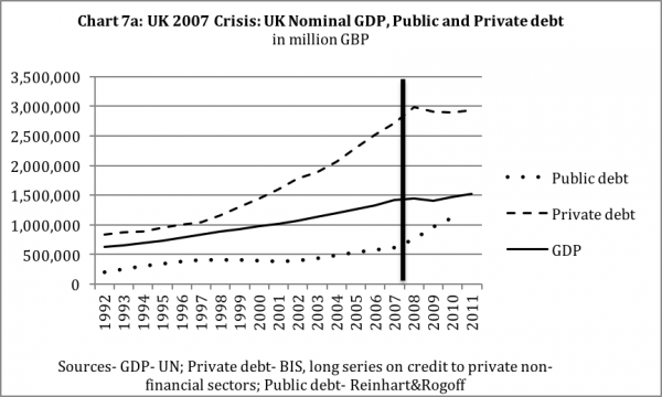
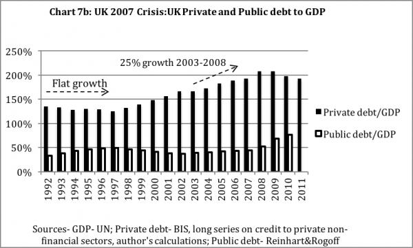
The eurozone—eighteen European Union member states that have adopted the euro (€) as their common currency—has a combined current GDP of $13.1 trillion. However, four countries alone—Germany, France, Spain, and Italy—compose 77 percent of eurozone GDP. Study those four countries, and you have a good sense of the whole.
Spain’s recent crisis came when it had reached private debt to GDP growth of 49 percent in five years and total private debt to GDP of 220 percent; France had reached 21 percent and 150 percent; and Italy had reached 33 percent and 118 percent. Of the four countries, Spain’s lending trends were by far the most egregious (see Charts 8a and 8b). Notably, Germany only reached 122 percent and had a decline in private debt to GDP of 10 percent, but it had a crisis nonetheless because it is so inextricably intertwined with the other eurozone countries. Combined, the four countries had 19 percent growth in private debt to GDP and 144 percent total private debt. Germany is almost a special case because its export rate is so extraordinarily high relative to other countries. In 2012, Germany’s exports to GDP were 52 percent, an enormous number compared to the United States’ 13 percent, France’s 27 percent, and Spain’s 32 percent. Even China—which we think of as a massive exporter—only exports at a level of 27 percent of its GDP. (Therefore Germany is, in some respects, as dependent on its neighbors as they are on it, though few frame it this way.) Germany’s export dependence on other countries is so high that it is to some degree more useful to think of the eurozone as a single entity—economically at least—where a portion of the rise in private debt of other eurozone countries is to finance purchases from Germany.
As we have shown for other countries, government debt levels were benign and even improving in all these countries in large part because of the growth in private debt and the false prosperity that it brought.
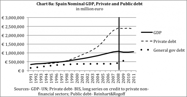
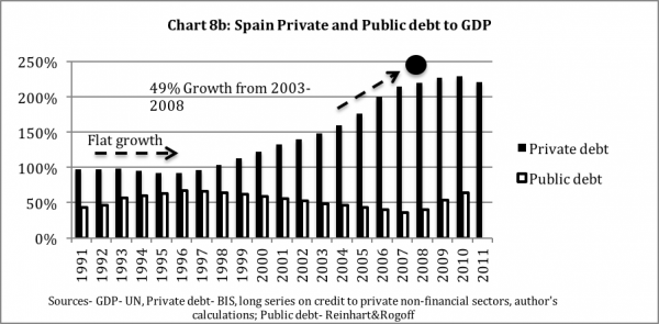
Many of the countries at the periphery of the eurozone were and are in even worse shape. Note the debt snapshots of Greece, Portugal, and Ireland in Appendix C, with Greece’s private debt to GDP growth of 58 percent in five years leading to its crisis. Portugal and Ireland’s current private debt levels are 250+ percent and 300+ percent, respectively, and hang like millstones around their economic necks.
Even though you would be hard-pressed to deduce this from press reports, the most critical current problem with the eurozone is the remaining high level of private debt. Of course, helping a given country in renewing maturing government debt or issuing new government debt—which is what most of the press reports are about—is important. But the persistent high level of private debt, not public debt, is what’s crippling eurozone economies.
[i] As an aside, after a crisis, people often compare current asset prices to prices that existed at the precrisis peak to assess whether things have fully recovered. However, since those peak values were artificially high, it is often more useful to compare to preboom trends extrapolated to the present.
[ii] This means two simple charts—one on top of (or beside) the other—that together portray that country’s debt through time. We call this the “debt snapshot.” When focusing on a specific calamity such as the 2008 crisis, we will show a chart covering the years before and after the beginning of that crisis. We show the years prior to the crisis extending from a period when debt growth was relatively flat. So for the 2008 crisis, we include the 1990 to 1997 period when private debt growth was essentially flat. Chart 4a shows the nominal totals for GDP, private debt, and public debt, along with a black vertical line marking the crisis year. The Chart 4b shows private debt and public debt in ratio to GDP with a black dot marking the crisis year. Since the percentage growth in private debt to GDP of 18 percent or more in a five-year span is the key trigger for a crisis, we will include a black-dotted arrow over any five-year period that is close to or above this 18 percent threshold. Of course, a debt snapshot is not a complete picture, but it does provide an orientation. Although we study inflation-adjusted amounts (sometimes referred to as “real”) in our analyses, in the debt snapshot, we use actual (sometimes referred to as “nominal”) totals as our first level of analysis because “real” often masks part of the story. For example, in the 1930s, looking at the “real” loan decline before looking at the “nominal” decline masks the steepness of this decline. The real decline is less steep because costs were declining—but the decline in prices was in some respects caused by that decline in loans and is thus in part circular, so it is important to start with the nominal. (We include the real charts in Appendix I.) We consider financial debt a very important part of the story, but financial debt growth is a function of the growth in business and household debt—it is often the other side of the balance sheet. And we found that growth in financial debt was not a better predictor of risk than business plus household debt. When it comes to these debt snapshots, we include only government, business, and household debt, because to add in financial institution debt double counts certain debt that would get eliminated in an actual accounting consolidation. So, for example, we calculate the current total debt of the United States as 256 percent—business debt plus household debt plus government debt—instead of 342 percent—business debt plus household debt plus government debt plus financial institution debt.

